Branding is as much a science as it is an art. The video above is an overview of part of the branding process at Saltwater: determining a brand’s color opportunity. There’s much more to determining a brand’s color palette than picking colors that work well together. There’s strategy involved in finding the color gaps in a market, psychology behind how people respond to certain colors, and creativity in building a way to own a brand’s chosen colors.
Below, members of our creative team discuss brands that leverage their colors well and others that don’t.
Which brands use their brand colors most effectively or creatively?
Diane LaPorte, Creative Director: Some of my favorites are the Tour de France, Target, John Deere, Tiffany Co., and Chanel, since absence of “color” can be more powerful
Dunkin’ is a good example. I’m not a fan of the colors, but you definitely recognize the brand.
Kristin Burke, Designer: Google. They do an excellent job owning their four main colors. They use all three primary colors (red, yellow, blue), with the addition of one secondary color, green. No matter what the application, whether it’s a department logo, application, platform, they use these four colors as a mix within their sub brands so viewers can immediately identify them as part of the Google family.
Kyle Mooers, Sr. Art Director: Coca-Cola, Ferrari, FedEx. Coca Cola and Ferrari are synonymous with the color red.
Jen Rygiel, Sr. Art Director: Coca Cola and Target. Also, Apple & Nike both use a colorless brand with great success.
What is a brand that could stand out more if it used a different color?
DL: Just about any insurance company. Also, Holiday Inn. In the mid-range hotel market, logos run the full spectrum of colors, so it’s not so much that Holiday Inn would stand out more as it would greatly benefit from having a slightly more upscale corporate color that better reflected the level of their accommodations.
KB: Speedway, the gas stations chain. They utilize the color red, which makes them invisible next to their larger competitors like Citgo, Texaco, Mobile, Chevron and Shell, who also use red. The only gas station competitor of theirs that doesn’t use red is BP (green and yellow). However, Speedway may have a chance to rise above their competitors as they were just purchased by 7-Eleven, the top convenience store operator in Japan. Whether the Speedway name stays or 7-Eleven decides to bring gas services under their belt, is yet to be determined. If the name stays, it would be nice to see some renewed branding efforts from their new owners. Article here.
KM: It’s a tough question because not all brands rely on 1-2 colors. Technically any brand could stand out more by switching colors—if Coca-Cola was pink tomorrow I think that would be highly noticed.
What is one thing brands should do more of when it comes to brand colors?
JR: I think consistency is most important. If a brand wants to depend on one color, then they need to stick to that color. Even if a brand wants to be colorless, then truly make it colorless and make sure one color doesn’t out-weigh the others because that focus color will become the brand color in the mind of the consumer.
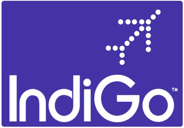
DL: Brands should look at things in a slightly different way. An example of this is IndiGo, an Indian airline. Not only a clever name, their logo color is indigo (yes, the color is spelled the same as the name of the company). Even though it falls into the established “blue” category symbolizing the usual: air, sky, trust, safety (which you definitely want in an airline), it’s the twist of the name of the airline and the choice of color that makes this brand effort stand out creatively. It is one logo that actually made me step back and say “Wow, someone actually did some serious thinking here”, and a big part of that is the color.
KB: Brands should ideally stick to their brand guidelines and color palettes. Once that is established, then they can choose to evolve their brand colors and guidelines from there. If they do a complete overhaul then they risk killing their brand’s recognition. The last statement depends on the size of the brand. If you are small, stick with your colors and guidelines. If you’re big, like New Balance, go ahead and venture beyond your color palette, because your logo speaks for itself, no matter what colors you choose.
What is your favorite part of determining a brand’s color palette?
KM: Uncovering the story that gives reason to the specific color(s) used.
DL: Getting immersed in researching the company and its competitors and seeing where that leads, then developing a personality for the brand based on color. For me, watching how a color palette emerges and ties the brand together is one of the most satisfying parts of a branding effort.
JR: I love when there is a true meaning behind the color palette chosen for a brand to make it have a story.
Tagged in:
Back