Stock imagery. Most people shudder at the term, thinking about the overly staged, cheesy photos you see all over the internet. Luckily, stock sites have really upped their game in the past couple years, making it easier for you or your designer to find the perfect photo to fit your needs.
The challenge today is learning to identify good stock photography and clearly articulating what you’re looking for. But worry not! This post will help you better understand what makes an image a “good selection” and how to articulate what you want to designers, so you receive exactly what you’re envisioning.
First off, let’s talk about the qualities that make a photo fall into the “good” category.
4 Tips for Choosing Good Stock Photos
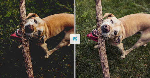
Look for images that feel natural and candid.
Over-posed photos throw up the biggest red flag in the stock imagery world. But if you or your designer do enough searching, you will find a gem within the sea of staged images. Focus on things like natural eye contact and relaxed body language.

Make sure photos are properly lit.
Always make sure that your images are properly lit and that this lighting is consistent, especially across groups of photos. A lot of times brands can’t do their own photo shoots, so there will be multiple stock images all living in the same space. Proper lighting is something that’ll help make your imagery feel authentic and all part of the same family.
It’s also important to remember that images always print darker than they appear. So if something looks good on screen, it most likely will look different once it’s printed. Make sure your photos have proper lighting and enough contrast between their lights and darks before printing.
Know your brand.
Having a defined look and feel for your brand is half the battle. You could find a beautiful photo, vivid in color, with sharp focus and bright lighting. BUT if your brand typically uses lighter images that have a soft focus and are less saturated, this new image will stick out like a sore thumb. Consistency is key, so make sure you know the basic qualities of your brand and keep them true.
Know your audience.
If the demographic you’re focusing on is females aged 25-35, then you don’t want to show a 40-year-old male in the imagery you choose. Seems obvious right? But sometimes you can lose focus of what’s important when you find a beautiful photo, even if it doesn’t check every box. Stay true to what you know! And the right image will come along.
Remember to:
- Portray your customer.
- Or portray whomever your customer is purchasing for, whether it be themselves, others, etc.

Now that you know what makes a “good” photo, it’s equally important to know how to critique something that may not be fitting the ask when a designer is presenting you with selects. This doesn’t mean the photo falls into the “bad” category, but it’s just not quite what you need. So how do you articulate what you’re looking for?
How to Provide Feedback on Stock Photo Selects
Give specific reasons as to why the image isn’t working.
The image isn’t bright enough. It feels crowded. You need more diversity. All are acceptable reasons why a particular image may not work. The one phrase you want to stay away from is, “I just don’t like it.” Can you feel this way? Of course! But if this is the only feedback, the next round of selects still likely won’t hit the mark. Be as descriptive as you can to call out the things that you don’t like, so there is direction for the designer to get it right the next time around.
Provide examples of things you like.
Take a quick search on Google to help better define what you’re looking for. If you type in a phrase and you’re not seeing anything that you would be interested in, you now know how not to describe what you’re looking for. Pull images that you like, to show your designer, even if it’s something that can’t be purchased. It can still help get the idea across of what you’re looking for.
Put yourself in the shoes of your target audience.
It’s hard to not let your personal feelings get in the way, but remember that you may not be the audience your brand is targeting. So try and to be unbiased, and step into the mind of your audience, rather than selecting images that appeal to you personally.
Now that you’re armed with the proper tools, it’s time to get crackin’! Hopefully this post makes your job a little easier, and allows you to get the assets you need with fewer rounds of revision – saving you a penny or two in the long run!
Back